Crayon &
Molotov.
The brief asked for a logotype, a favicon and two banners. What shipped was a system that answers the questions nobody had asked yet.

A pencil and
a firebomb.
Atelier Crayon & Molotov is a French associative label with one line at the top of its manifesto: make the revolution through art. An artist is chosen, the artist chooses a cause, a short run of clothing is printed in France on organic and recycled stock, and the larger share of the profit goes straight to that cause.
The brief was five lines long and asked for a logotype, a favicon and two banners. It also carried two constraints that decided everything: no fluorescents and no semi-transparency, because neither survives print. So the mark was built to work in a single ink, at fifteen millimetres on a neck label, before it was ever allowed to look good on a screen.
Colour is a parameter, never a duplicate of the geometry.
The rule the whole system is built on

One file.
Every version.
Source architecture — one Illustrator file


A light drawing on a dark ground reads heavier than the same drawing dark on light. So every form exists twice: solid for dark-on-light, and a deliberately thinned version for light-on-dark. Everything else, every colourway and every size, is generated at export from a single source file. One curve correction propagates to all 164 files.
Eight forms,
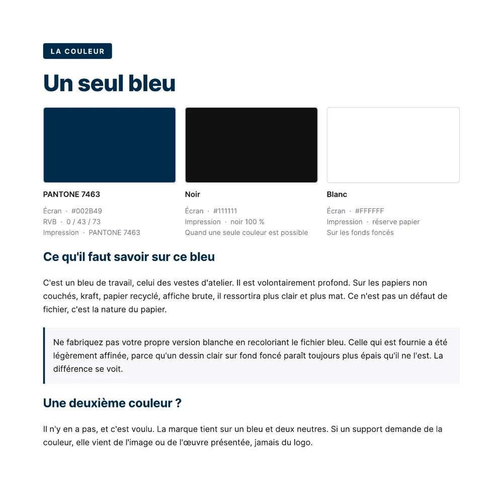
one blue.
Delivered — 164 production files
The package is sorted by what you are about to do, not by file format. Nine numbered folders: everyday logo, print, web and social, textile, typefaces, source files, legal, pattern, and the manual on top. A client who reads the folder names already understands what they bought.


They asked for a logo. They can now brief a printer, a supplier or another designer without me in the room.