Nike.
Nike reached out directly — then kept coming back for four years. Basketball, Sportswear, tee after tee: bold characters injected into the most locked-down brand system in sportswear.
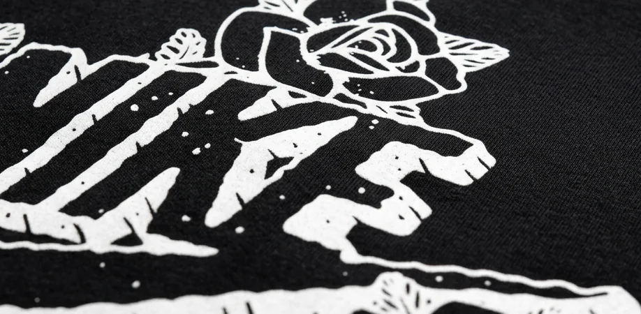
Personality
inside the system.
Nike reached out directly, multiple times across several years. It started with Nike Basketball, then Sportswear, plus tee designs through agencies holding Nike accounts. Each brief had its own direction, but the thread never changed: bold graphics, strong characters, street culture energy — inside one of the most structured brand systems in the world.
Every round was the same dance: inject personality without losing the Swoosh DNA. Character sketches or typography first, then print-ready files fitting their production pipeline. Over the years it became a rhythm: they knew my style, I knew their system. The 2014 run alone was four artworks, approved round after round from Beaverton.
"Yes I received files! Great work! Overall Team here loves your art!"
Henry Tam — Nike, April 2014

Print-ready
or nothing.
Working documents — raw
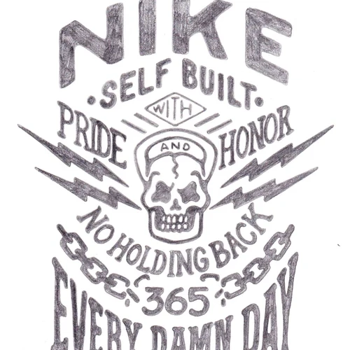

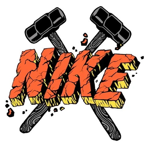
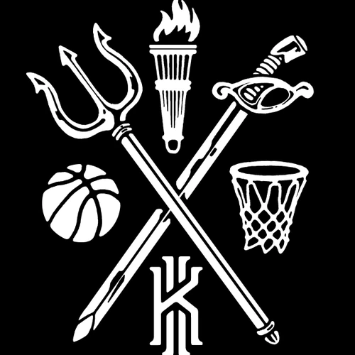
No art direction survives contact with a production pipeline unless the files are built for it. Every graphic shipped print-ready: separations clean, characters holding at chest-print scale, Swoosh usage by the book. That's why they kept calling back.
On bodies,
not boards.
Final result — real life
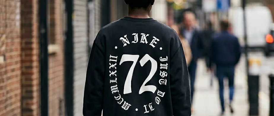 OUT IN THE WORLD
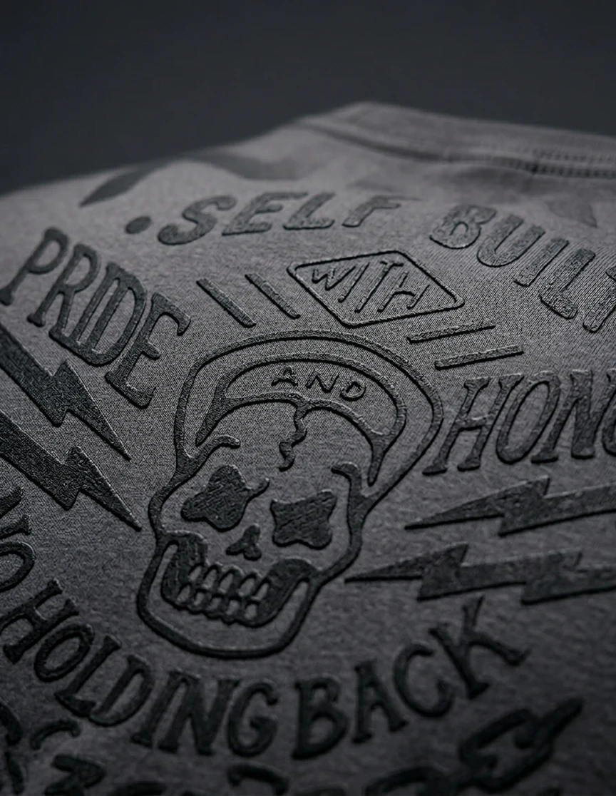 ON THE FABRIC
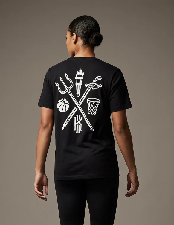 BASKETBALL CREST
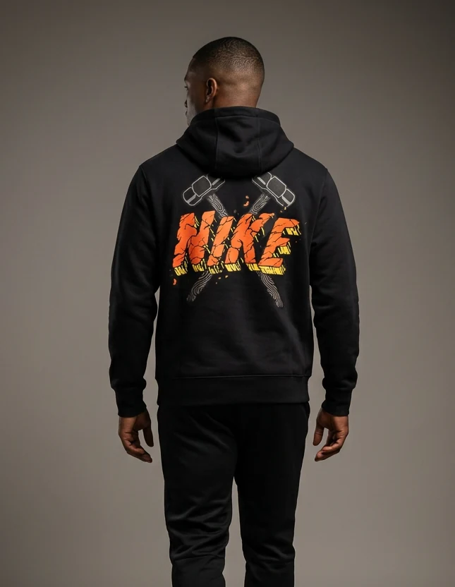 HAMMERS — HOODIE
Tee
after tee.
The line, piece by piece
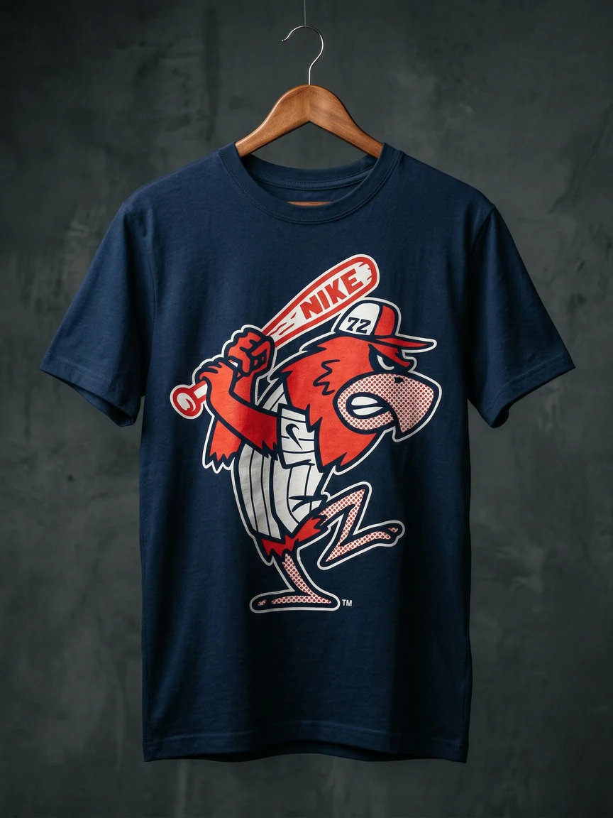
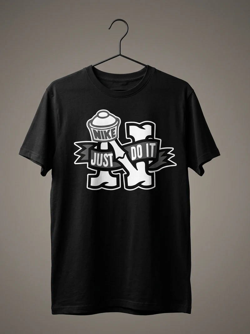
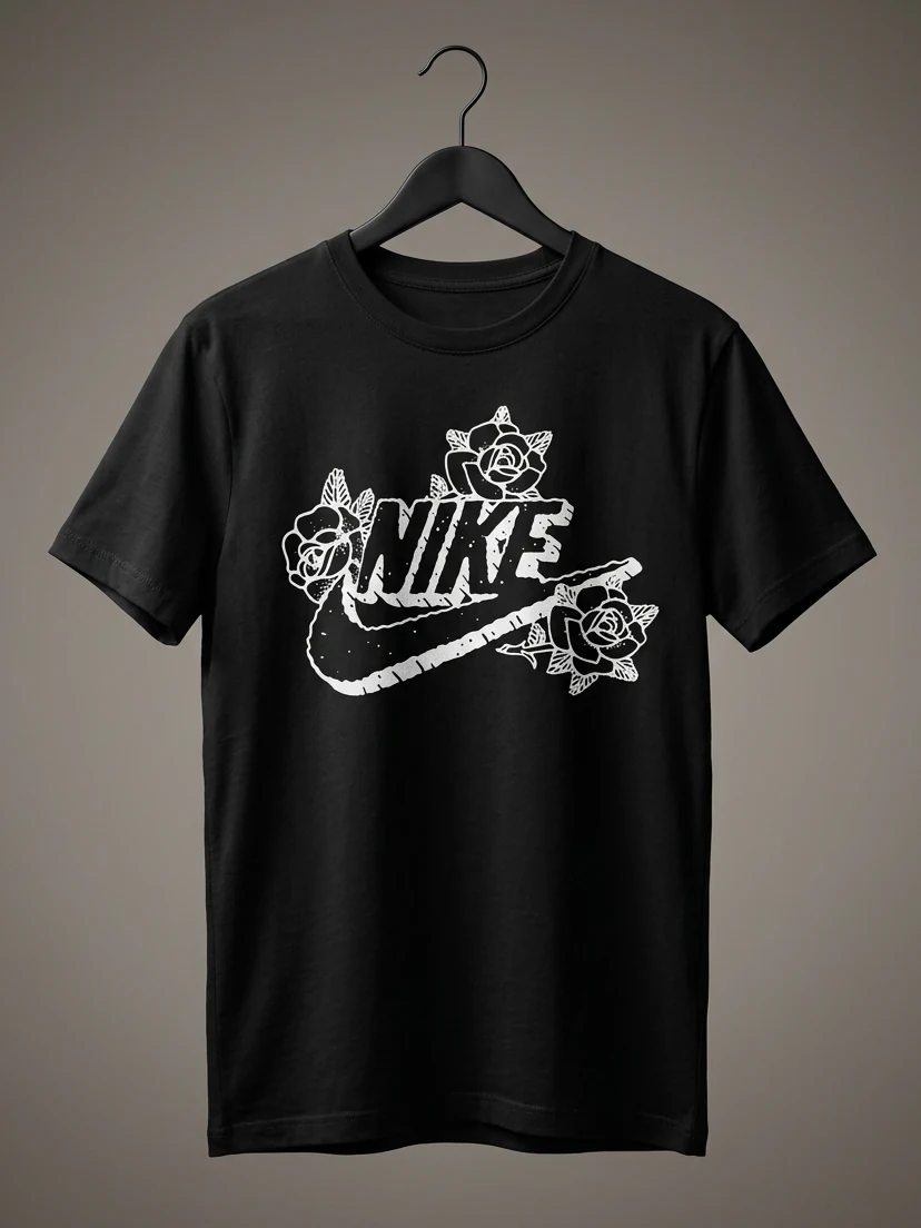
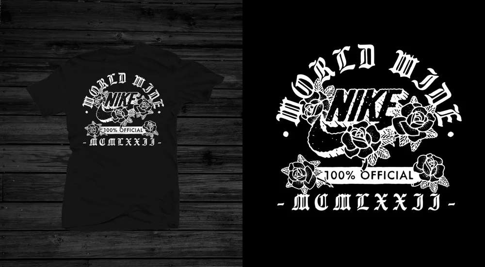
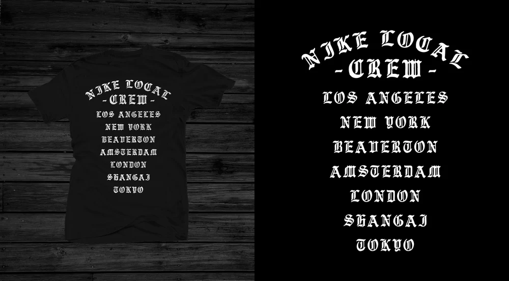
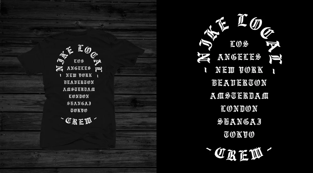
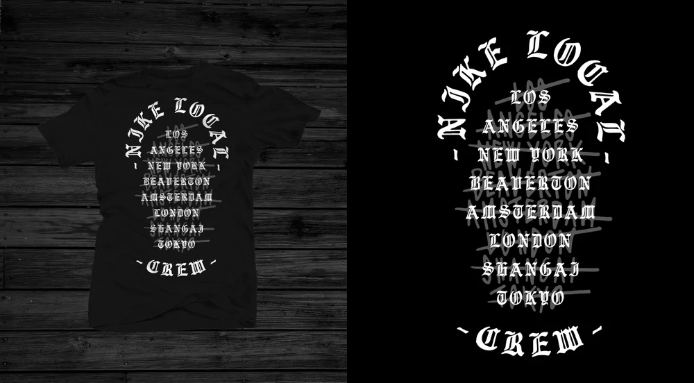
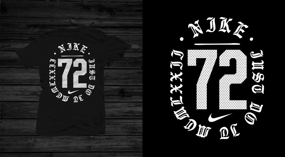
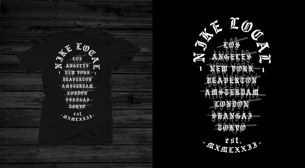
Nike came to me — then came back, year after year, brief after brief, division after division. Repeat business inside the Swoosh system is the hardest reference there is.